Mastering Balance and Proportion: A Designer’s Guide to Harmonious Spaces
Ever walked into a room that just felt “off” but couldn’t pinpoint why?
I’ve been there, and chances are, it was probably due to imbalanced proportions.
Let me show you how to nail that perfect balance in your space.
The Golden Rules of Scale (That Actually Work)
Here’s what I’ve learned after years of designing spaces:
Your furniture should never exceed 2/3 of your wall length – trust me on this one.
A sofa that’s too big will make your living room feel like a sardine can.
Think of your room like a musical composition:
- Large pieces are your bass notes
- Medium items create the melody
- Small accessories add the perfect high notes
Getting Your Proportions Right (Without a Design Degree)
Start with these foolproof ratios:
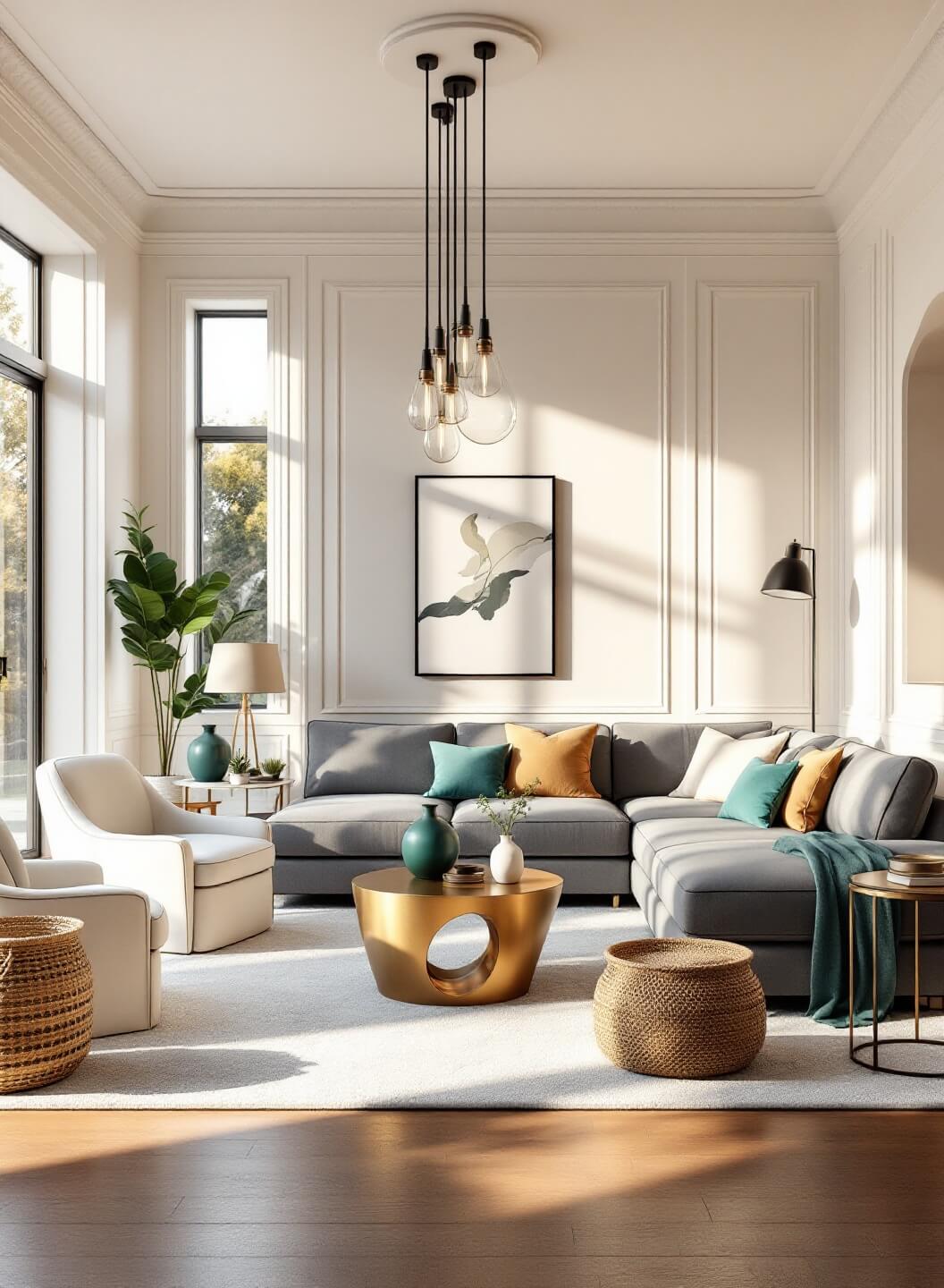
- The 60-30-10 Rule
- 60% dominant color (usually walls)
- 30% secondary color (furniture)
- 10% accent color (accessories)
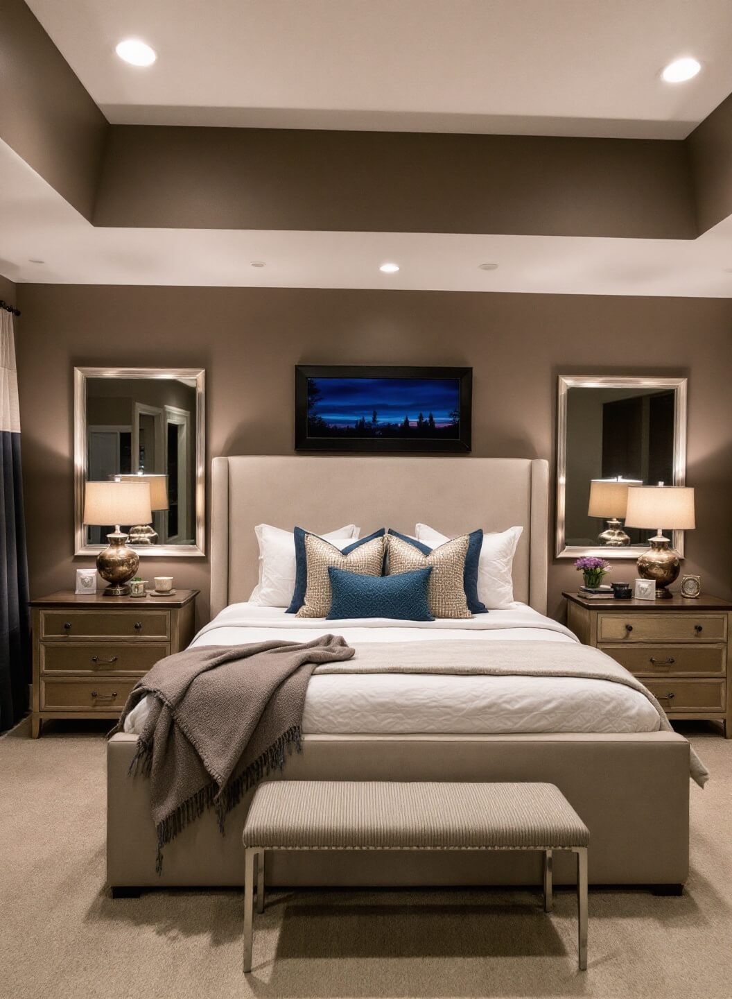
- Furniture Heights
- Coffee tables should hit just below your sofa seat
- Side tables should align with your armrests
- Art should hang at eye level (about 57-60 inches from the floor)
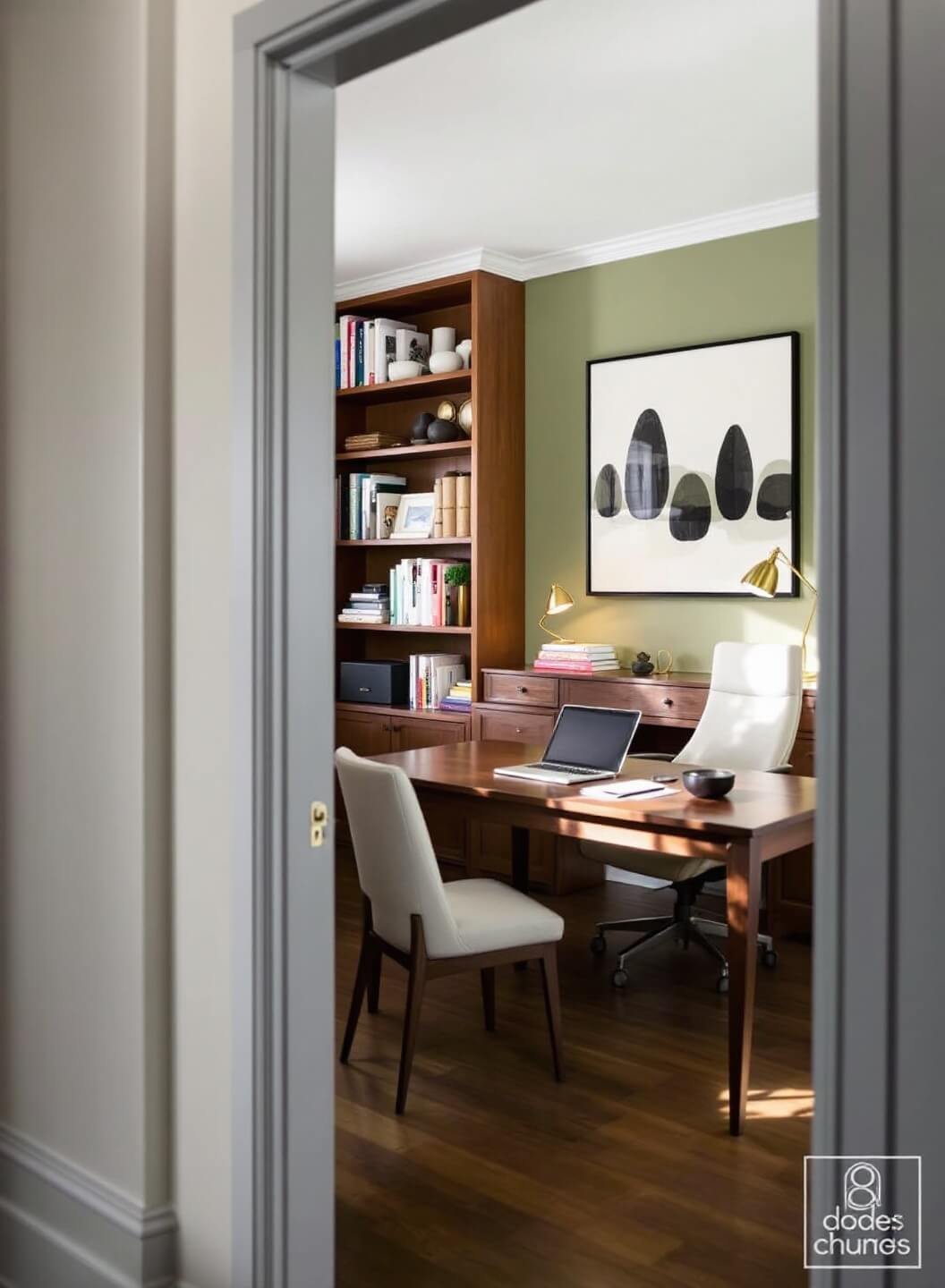
Balance Tricks I Swear By
Creating symmetry doesn’t mean making everything identical.
Here’s what works:
For Visual Weight:
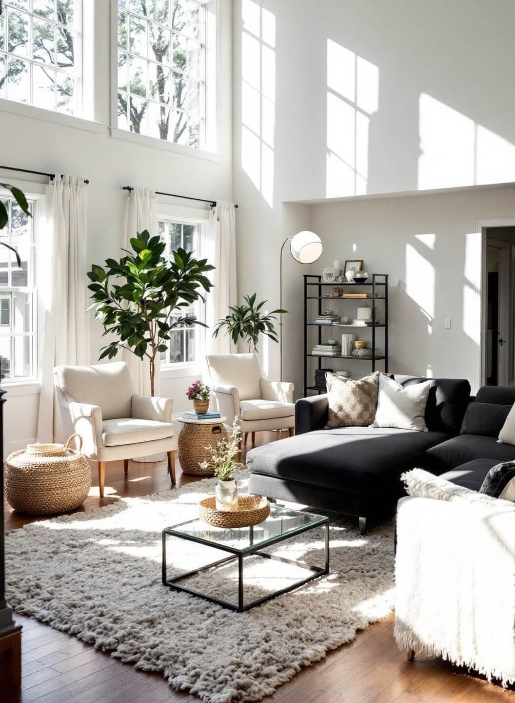
- Match a large sofa with two smaller chairs
- Balance a heavy armoire with a cluster of smaller pieces
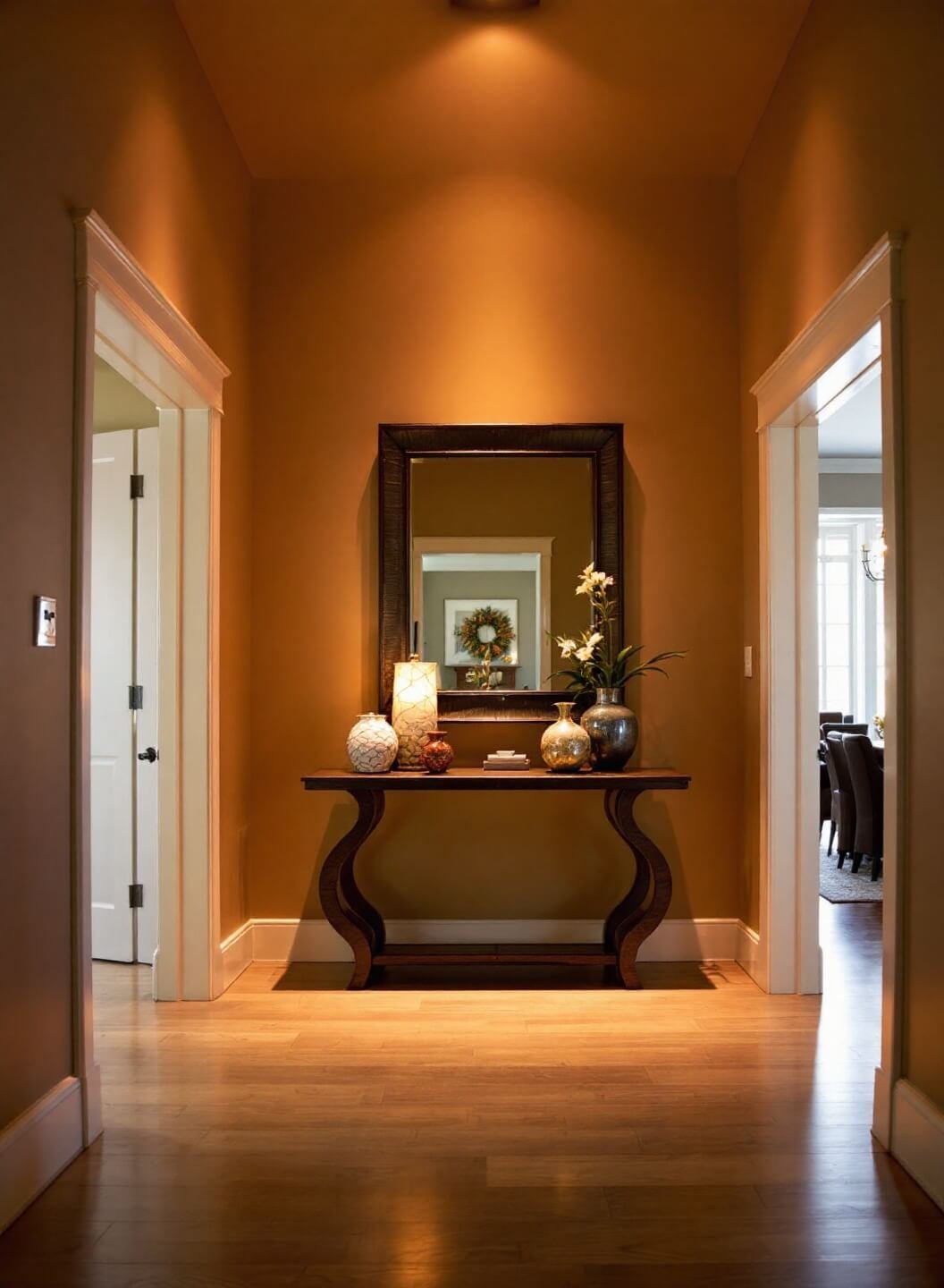
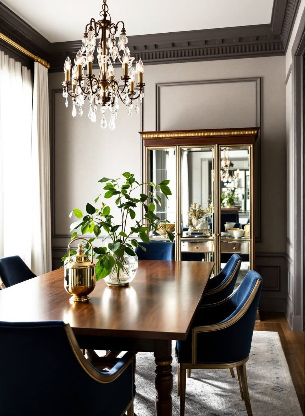
- Use mirrors to reflect light and create perceived space
My Go-To Room Layout Formula
- Anchor Piece First
Place your largest piece (usually the sofa) against the main wall
- Conversation Areas
Keep seating pieces no more than 8 feet apart for comfortable chat distances
- Traffic Flow
Leave at least 30 inches for walkways
Quick Fixes for Common Proportion Problems
Too Much Furniture?
- Remove one piece – less is often more
- Pull furniture away from walls
- Add a large mirror to create depth
Room Feels Flat?
- Mix up your heights
- Add layered lighting
- Incorporate different textures
Pro Tips You Won’t Find Elsewhere
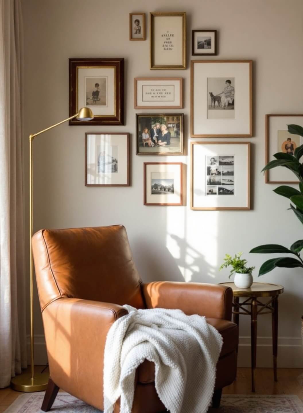
- The Rule of Odd Numbers
- Group decorative items in 3s or 5s
- Vary heights within each grouping
- Keep similar items together
- The Empty Space Rule
- Leave 20% of surfaces empty
- Don’t fill every corner
- Give your eyes somewhere to rest
Remember: Good design isn’t about rules – it’s about what feels right in your space.
Start with these guidelines, then trust your gut.
The best rooms are those that make you feel at home the moment you walk in.