The Psychology of Color in Home Design: Creating Spaces That Speak to Your Soul
Listen, I’ve been in interior design for over 15 years, and let me tell you – color isn’t just about making things pretty. It’s about creating a space that actually affects how you feel and function.
The Power of Color Psychology
You know that feeling when you walk into a room and immediately feel calm? Or energized? That’s color psychology at work.
Here’s what different colors can do for your space:
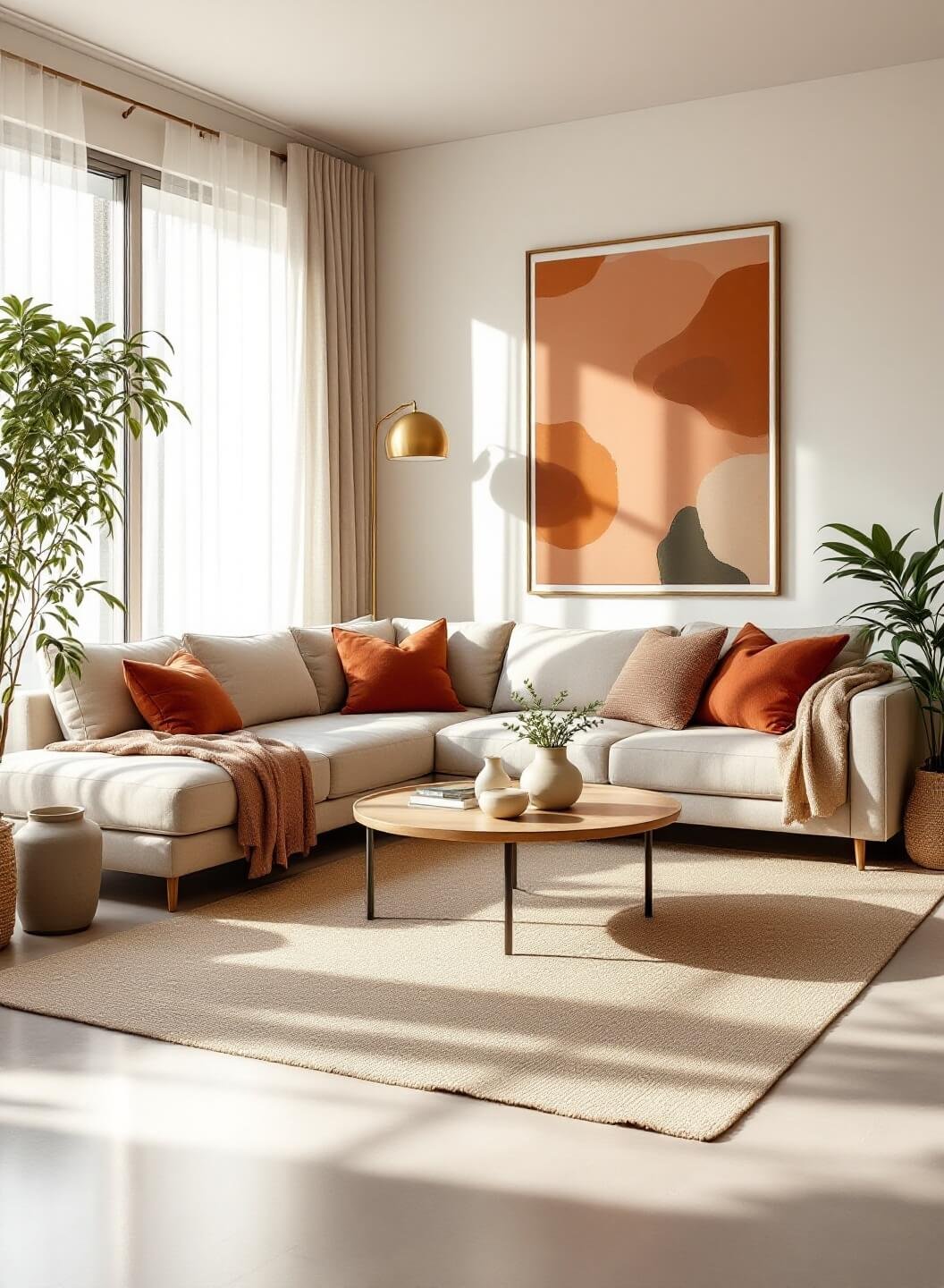
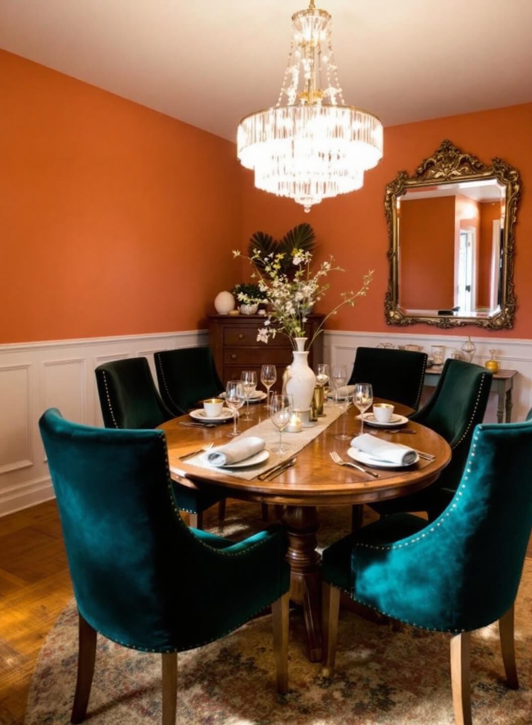
- Reds and Oranges:
- Stimulate appetite and conversation
- Perfect for dining rooms and social spaces
- Can increase heart rate and energy levels
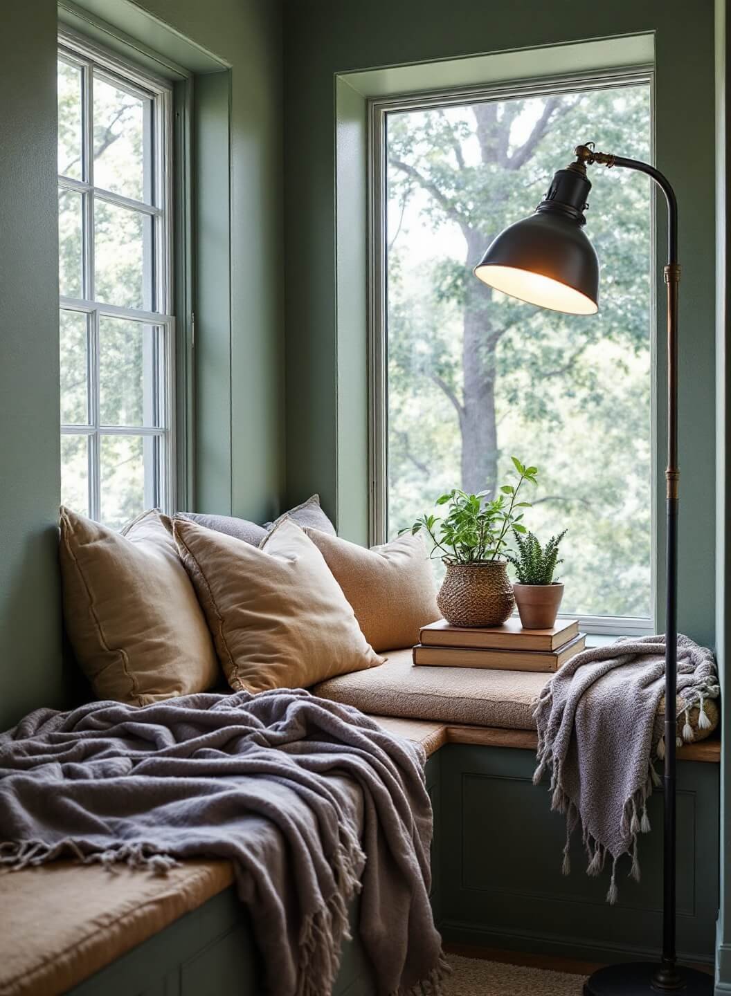
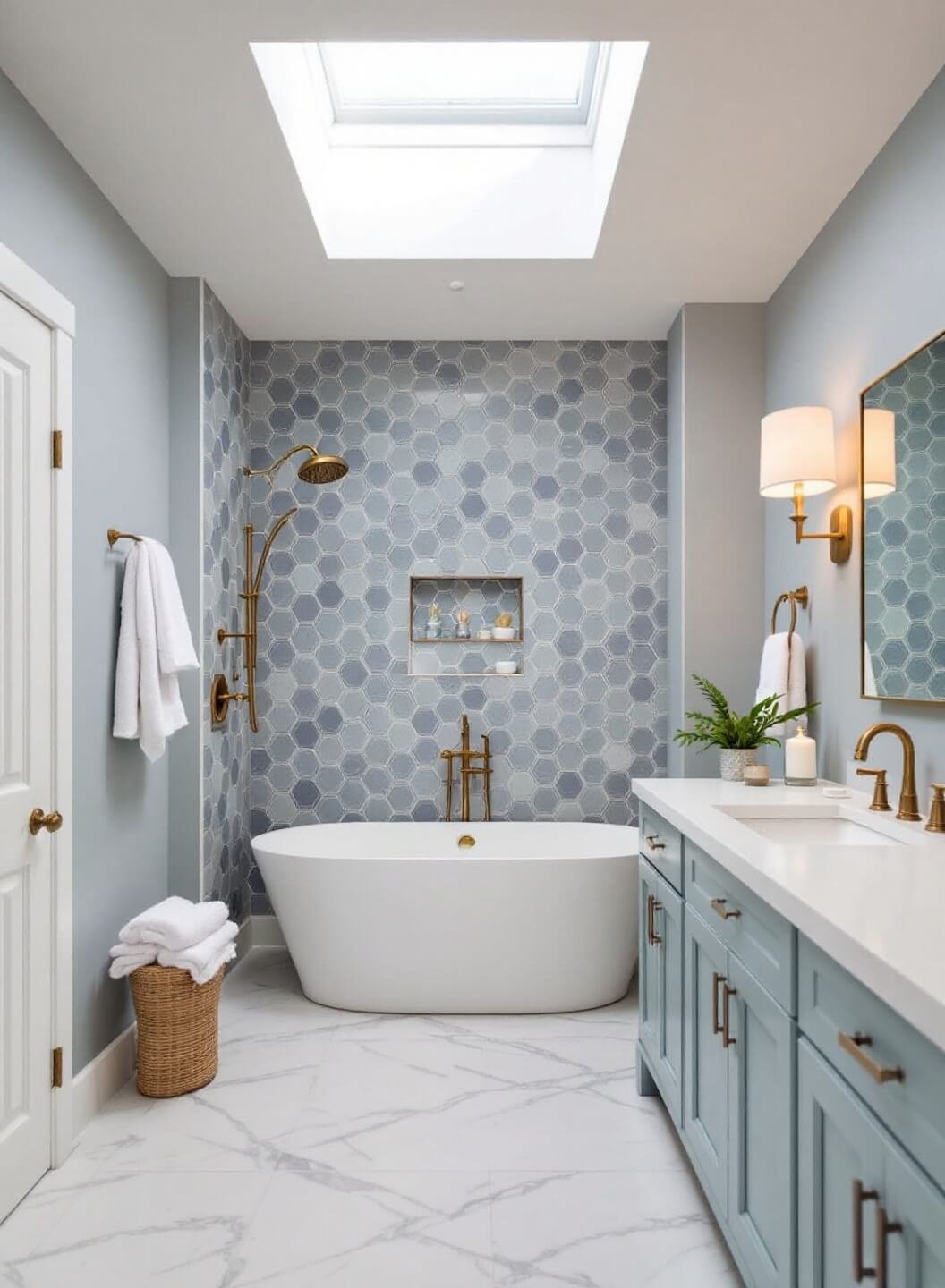
- Blues and Greens:
- Promote relaxation and peace
- Ideal for bedrooms and bathrooms
- Lower blood pressure and reduce stress
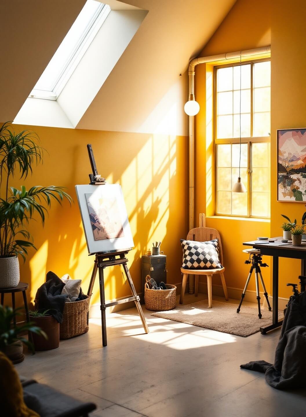
- Yellows:
- Boost creativity and optimism
- Great for home offices and kitchens
- Can improve focus and productivity
Room-by-Room Color Guide
Living Room
I always tell my clients – this is where life happens. Choose colors that encourage connection:
- Warm neutrals for a cozy vibe
- Deep greens for grounding
- Soft terracotta for warmth
Bedroom
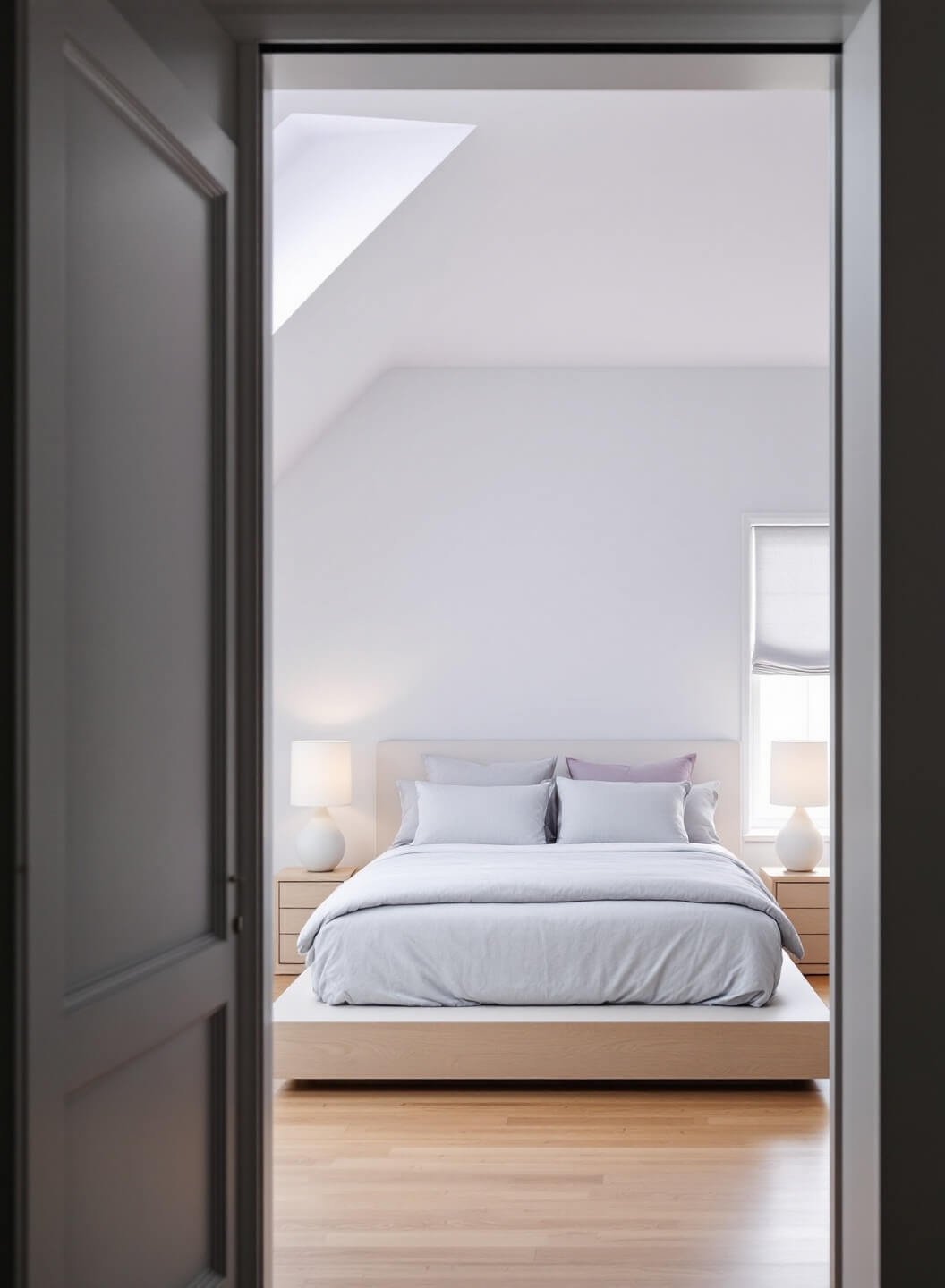
Think of this as your sanctuary:
- Soft blues for better sleep
- Lavender for relaxation
- Gentle grays for sophistication
Kitchen
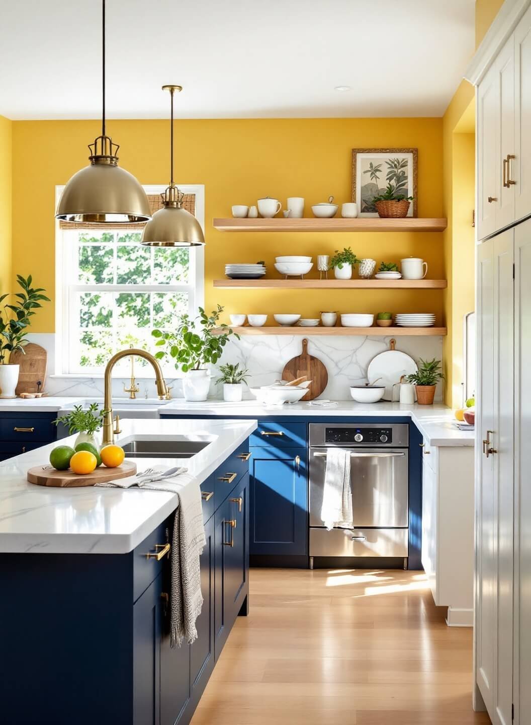
This isn’t just about cooking – it’s about creating memories:
- Yellow for energy and appetite
- White for cleanliness
- Blue for appetite control (yes, really!)
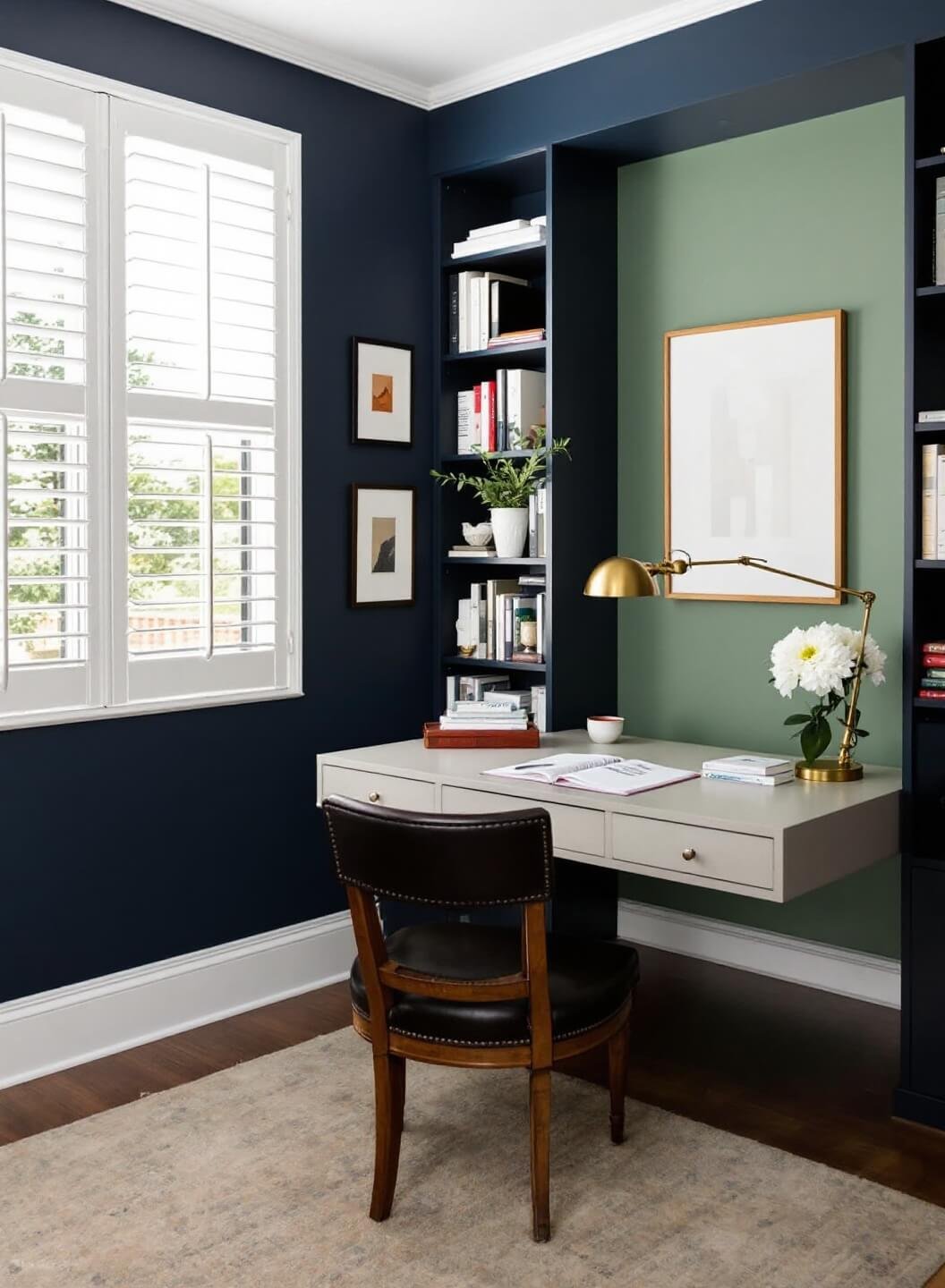
Home Office
Focus is key here:
- Navy blue for productivity
- Sage green for creativity
- Warm white for clarity
Pro Tips For Color Success
- Test Before You Commit
Always, always get sample pots. Paint large swatches on your walls and observe them at different times of day. - Consider Light Sources
Natural light changes everything. North-facing rooms need warmer tones, while south-facing spaces can handle cooler colors. - Use the 60-30-10 Rule
- 60% dominant color (walls)
- 30% secondary color (upholstery)
- 10% accent color (accessories)
Common Mistakes to Avoid
Don’t:
- Go too bold in small spaces
- Ignore your home’s architectural style
- Follow trends blindly
- Forget about connecting spaces
The Bottom Line
Color isn’t just decoration – it’s a powerful tool that can transform your home’s energy.
Start with one room, experiment with samples, and remember – your home should feel like you, not like a magazine spread.
Trust your gut, but follow these guidelines, and you’ll create spaces that not only look amazing but feel exactly right.
Remember: Life’s too short for beige walls (unless beige makes you happy – then go for it!).
