Modern Farmhouse Colors: A Designer’s Guide to Creating Your Perfect Palette
Hey there! I’m Sarah, an interior designer specializing in modern farmhouse aesthetics, and I’m here to help you nail that perfect color scheme that’ll make your home feel both cozy and current.
The Foundation: Your Neutral Base
Let me tell you, getting your base colors right is like baking – it’s all about the fundamentals.
Here’s my tried-and-true neutral palette:
- Pure Whites (My go-to: Benjamin Moore’s “Simply White“)
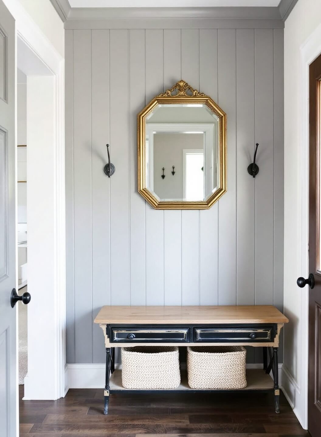
- Soft Grays (Personal favorite: “Gray Owl“)
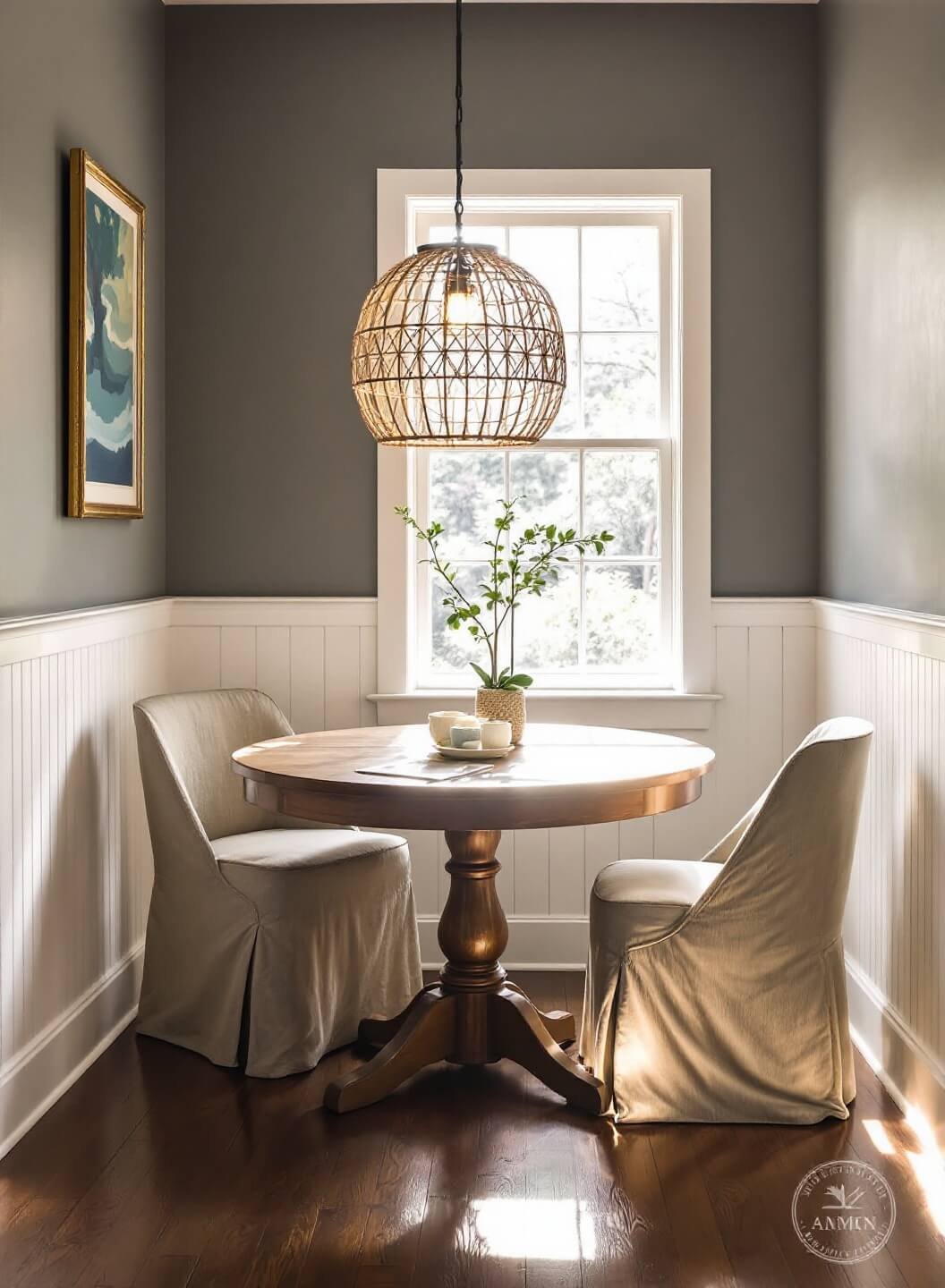
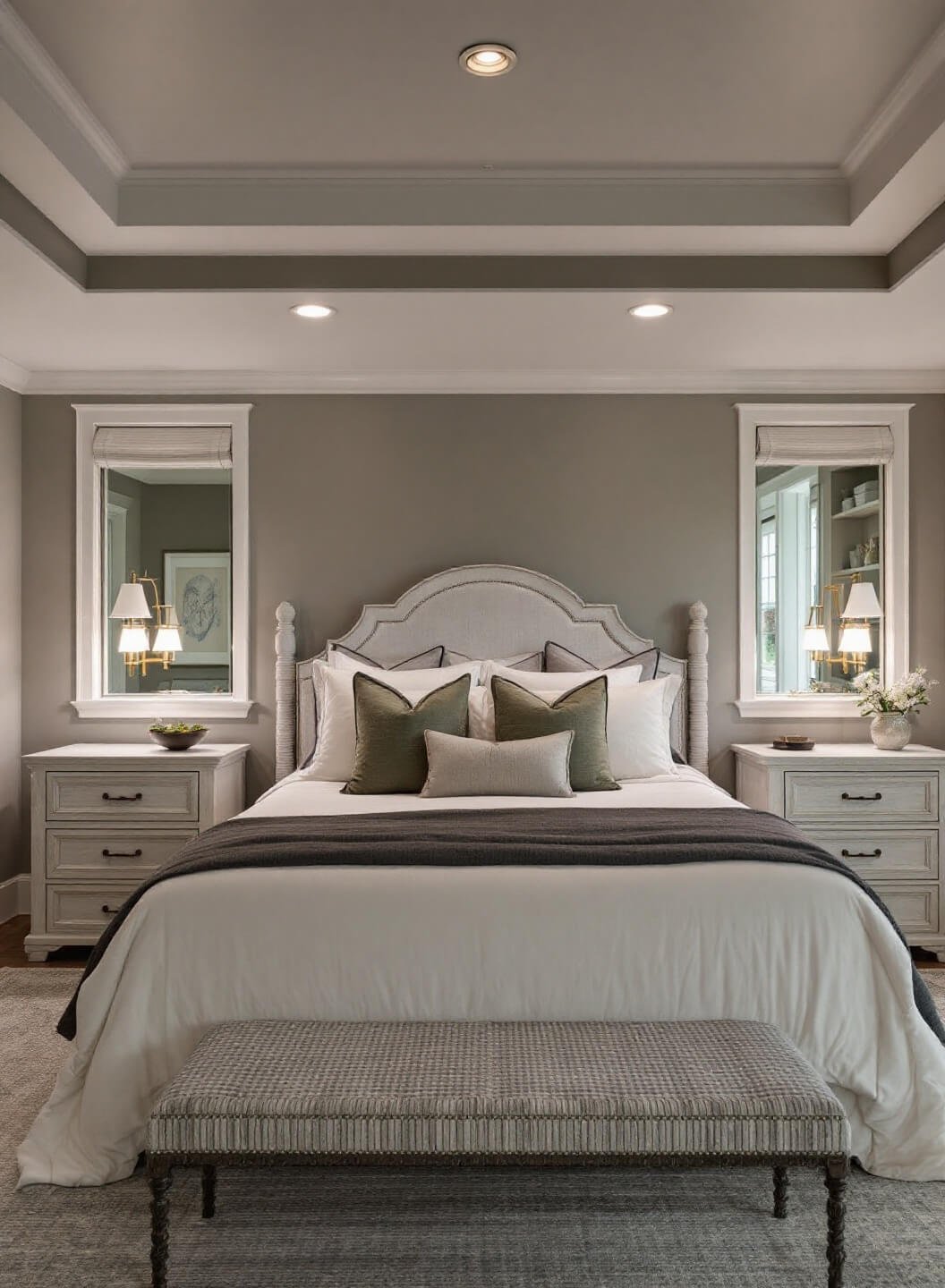
- Warm Beiges (Can’t go wrong with “Revere Pewter“)
Earthy Elements That Actually Work
I learned this the hard way – not all earth tones are created equal! Here’s what really shines:
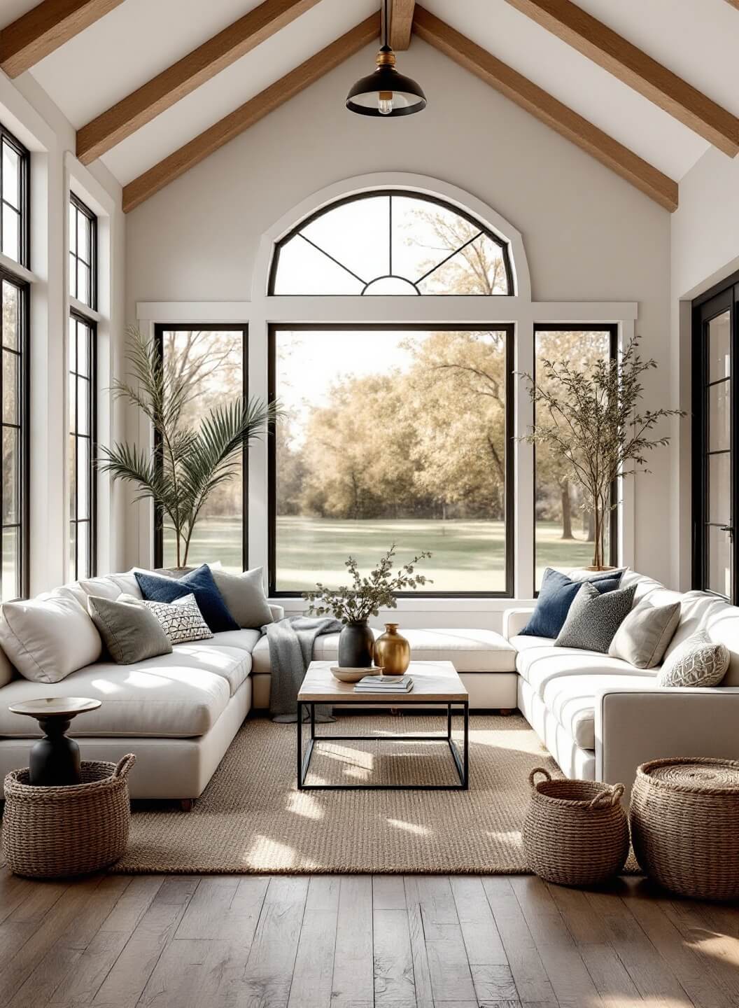
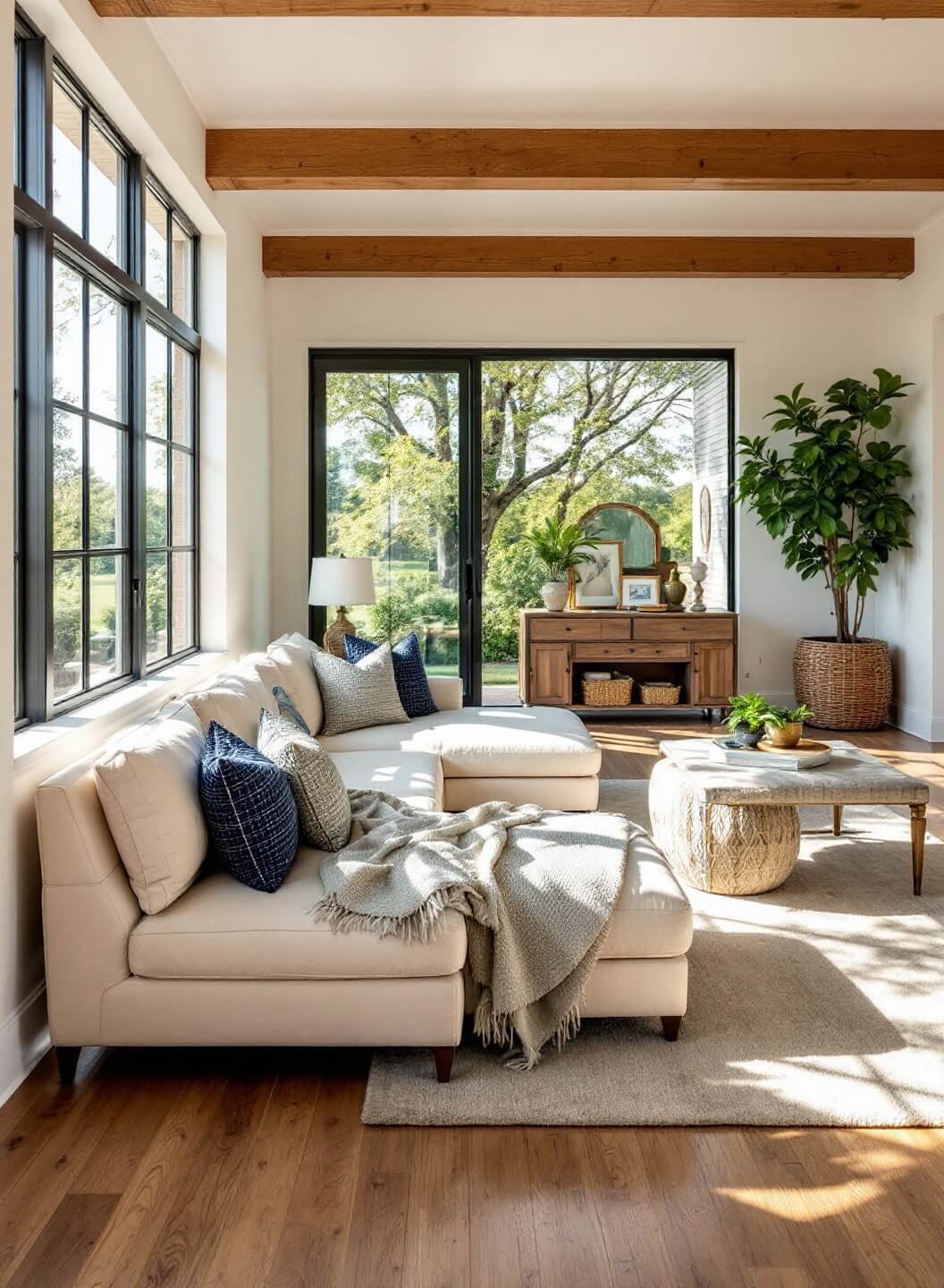
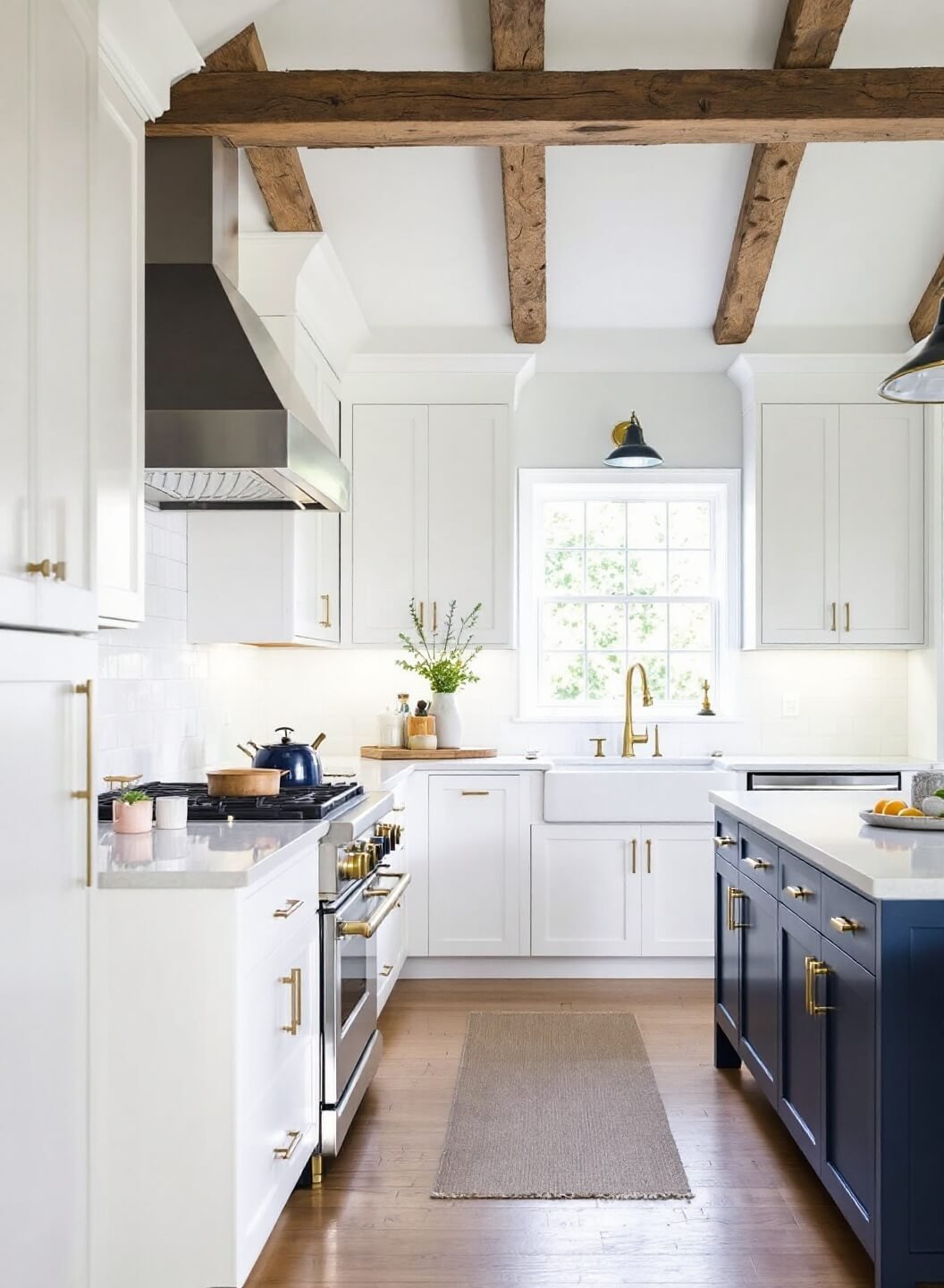
- Warm woods (especially on exposed beams)
- Natural stone accents
- Sage green touches
- Deep navy statements
Pro Tip: I always tell my clients to stick to the 60-30-10 rule:
- 60% dominant neutral
- 30% secondary color
- 10% accent color
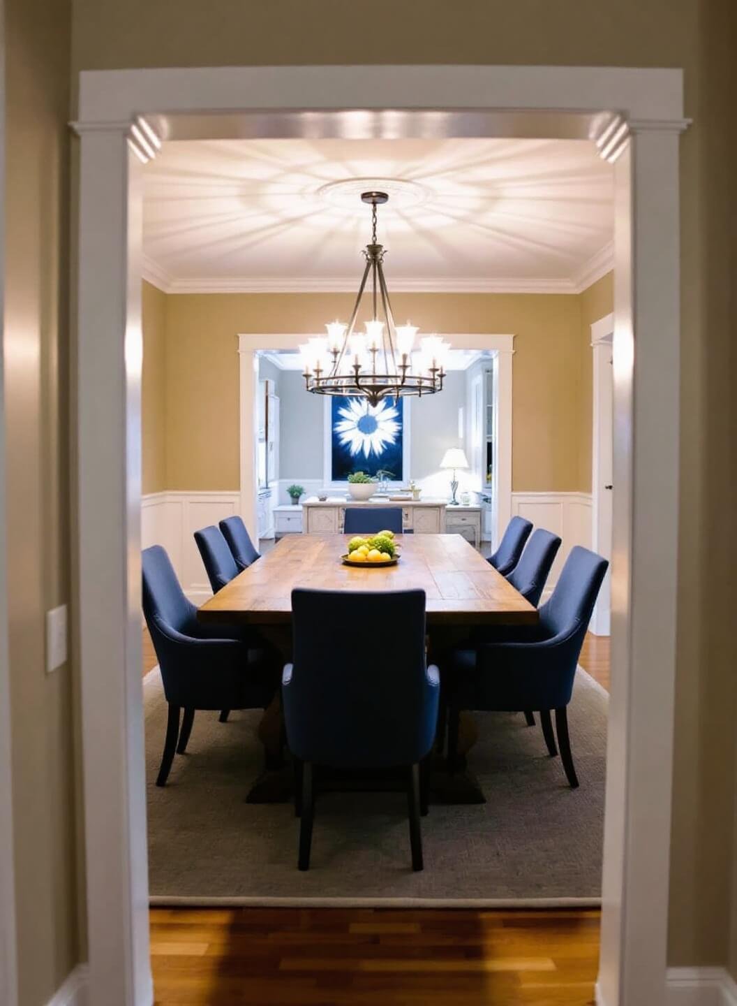
Show-Stopping Combinations I Swear By:
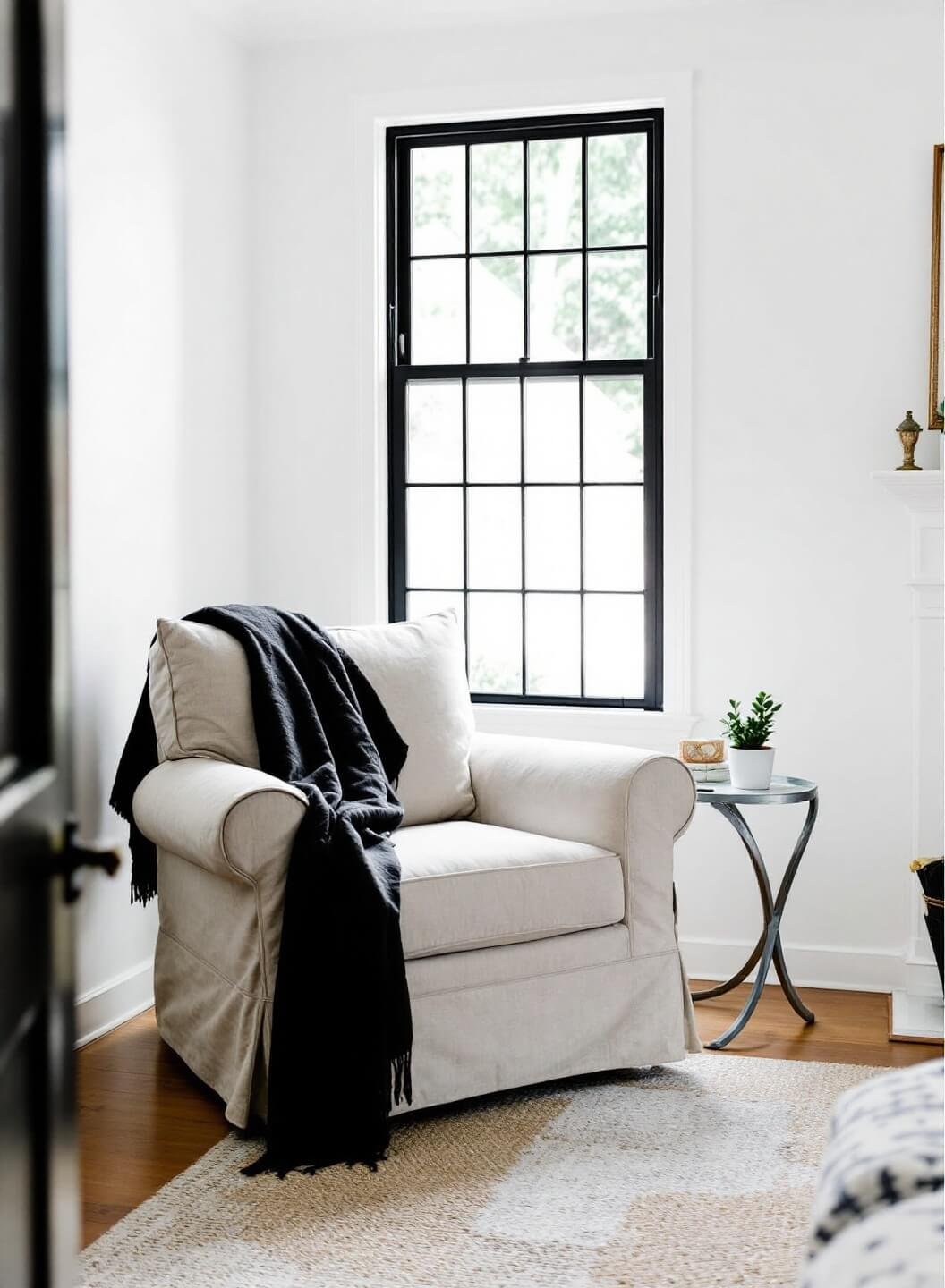
- Crisp white walls + black window frames + natural wood beams
- Soft gray walls + white trim + navy accents
- Warm beige + charcoal details + sage green touches
Mixing Textures Like a Pro
Trust me, color isn’t everything! Here’s how I layer textures:
- Matte walls with semi-gloss trim
- Rough wooden elements against smooth painted surfaces
- Woven textiles against solid colors
Common Mistakes to Avoid
(I’ve seen these too many times!)
- ❌ Using stark white everywhere
- ❌ Forgetting about undertones
- ❌ Overdoing the accent colors
My Secret Weapon
Here’s something I rarely share: I always test colors during different times of day. Natural light changes everything, and what looks perfect at noon might look completely different at sunset.
Remember: Modern farmhouse isn’t about perfection – it’s about creating a lived-in, welcoming space that feels both fresh and timeless.
Need more specific guidance? Drop your questions below, and I’ll help you create your perfect palette!